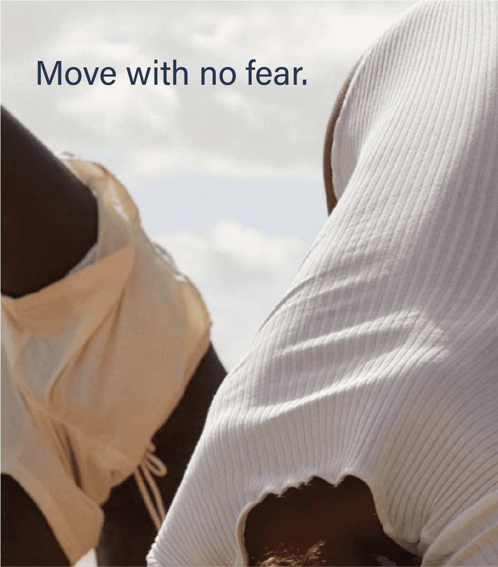
Following Wärtsilä's new company strategy in 2022, the brand needed to evolve alongside it. Rather than a full rebrand, this project focused on uplifting and enhancing the existing visual identity. This includes enhancing what worked while introducing new elements to support the company's expanding communication needs.
Year:
@2022
Industry:
Maritime & Energy
Client:
Wärtsilä Oyj
Video : Jennifer Carp
I worked closely with the brand team to define and roll out the refreshed identity across digital and traditional touch points. Led the visual evolution of the identity, refining the logo variant, rebuilding the colour and type foundations, and defining clear guidelines for how the brand is used in the new visual presence. Throughout the process, I worked in close collaboration with the wider brand team, aligning on design direction, testing applications across real business use cases.
Business problem
The existing identity hadn't kept pace with the company and it no longer reflected the scale or ambition of the business. The colour palette often misused the accent orange colour and the Logo lacked accessibility for the new product platforms.
The work
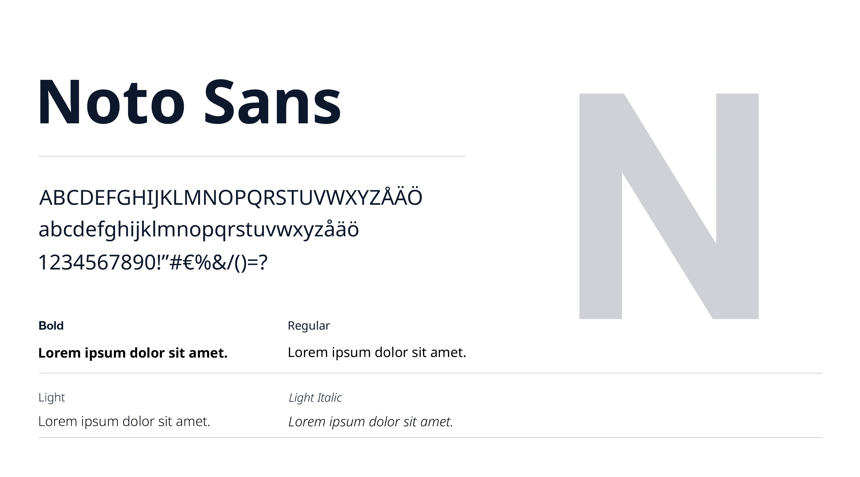
Typography: A new typeface, Noto Sans, was introduced to bring a more contemporary, distinctive voice to the brand's written communication, replacing the previous system typeface across brand materials
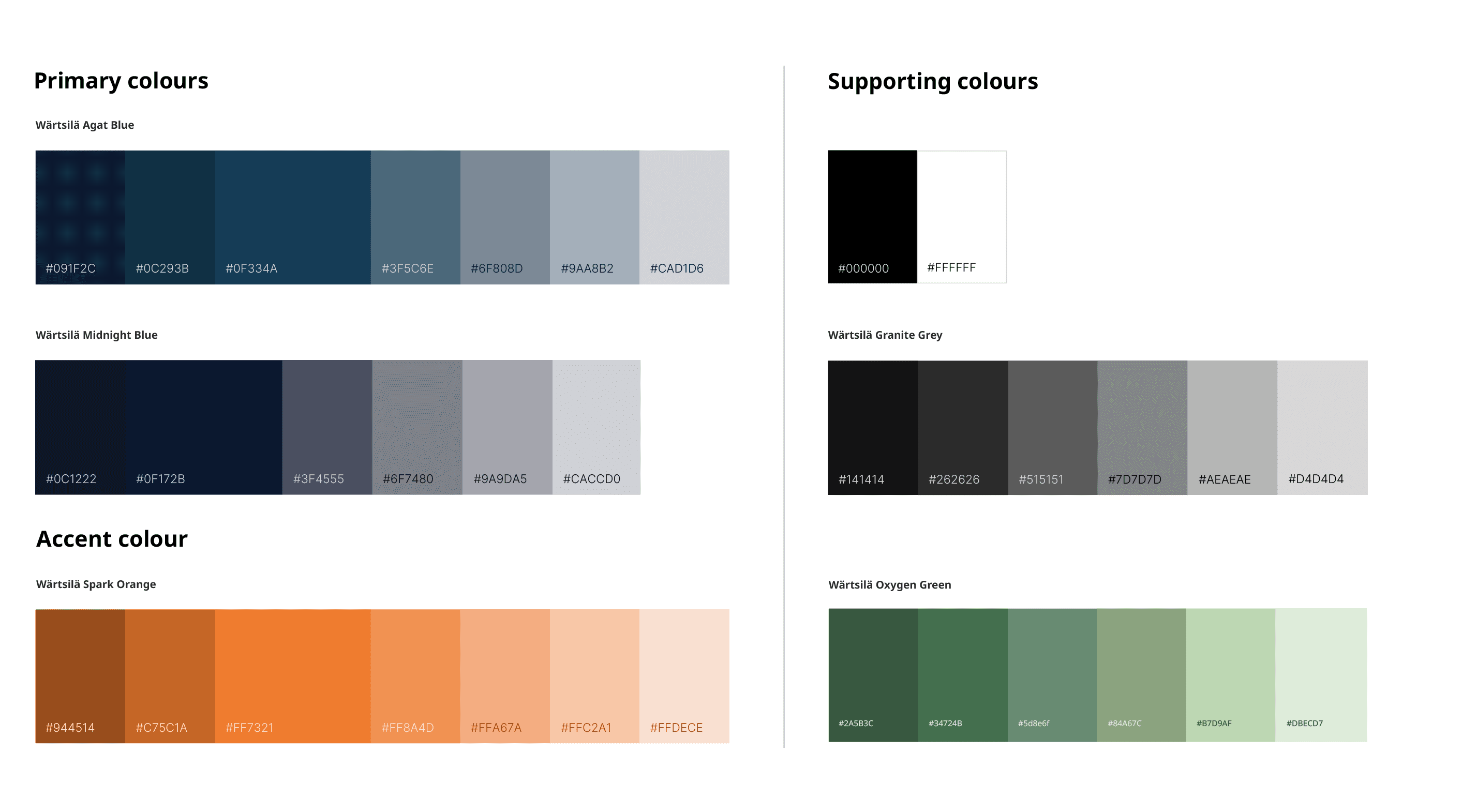
Colour system: The primary brand colours were kept largely intact but uplifted in tone and application. To meet the growing need for colour beyond brand expression, a new infographic colour palette was introduced, a set of supporting colours designed specifically for product identification, colour-coded results, and data visualisation in charts and reports, without diluting the primary palette's role as the face of the brand.
Grid system (Omnigrid): The existing structural grid, Omnigrid, was retained in its core format, with one key update: corners were softened from sharp to rounded, bringing it visually in line with the refreshed identity.

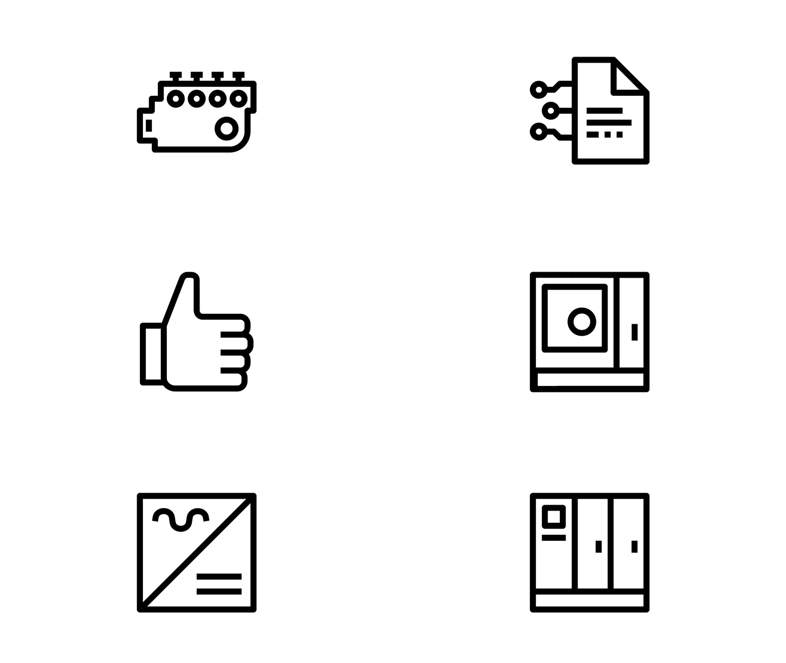
Iconography: The icon set was softened from its former industrial, sharp-edged, and bulky style into a lighter, more approachable style with subtle curvature, while still keeping the Wärtsilä's technical, engineering-driven character.
Impact
This brand refresh project translated Wärtsilä's 2022 strategy to align the brand into closer visual alignment with where the industry stands today, while giving both digital and print presence a more current look and feel. More broadly, it sent a clear message to the audience: a business with a rich history, still willing to evolve and stay open.
Collaborators & Approvers : Annelie Sundfors, Jennifer Carp, Marianna Vento, Virva Äimälä, André Snåre, Kaj forsström, Ritva Seppänen